Story Resolutions, Cropping and Image gutter explained.
How to get the best results when posting to story media with Sked Social.
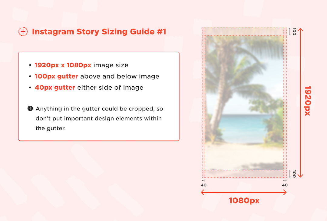
When posting stories, Instagram recommends using the resolution of 1080w x 1920h, which suits most phones.
However, phones have greatly varying resolutions and aspect ratios, and handsets as new as the iPhone 11 don’t have a full 1080 pixels in width. Instagram will crop, resize or resample the image to display on devices in certain ways that can’t be controlled, due to a range of factors including phone screen resolution, and also the quality of the user’s internet connection.
These can be imperceivable to the user, especially when posting photo media, but obvious when working with designed media, as it may crop components like text or logos that are on the edge of frame.
Recent iPhone screen resolutions and aspect ratios. Android devices also have a very wide range of display resolutions, but for simplicity, we’ll just discuss iPhone screen resolutions.
|
|
Height |
Width |
Aspect Ratio |
|
iPhone 6, 7, 8 |
1334 |
750 |
16:9 |
|
iPhone 6, 7, 8 Plus |
1920 |
1080 |
16:9 |
|
iPhone X, Xs |
2436 |
1125 |
19.5:9 |
|
iPhone 11 |
1792 |
828 |
19.5:9 |
|
iPhone 11 pro |
2688 |
1242 |
19.5:9 |
|
iPhone 11 Pro Max |
2688 |
1242 |
19.5:9 |
|
iPhone 12 |
2532 |
1170 |
19.5:9 |
|
iPhone 12 Mini |
2340 |
1080 |
19.5:9 |
|
iPhone 12 Pro |
2532 |
1170 |
19.5:9 |
|
iPhone 12 Pro Max |
2778 |
1242 |
19.5: |
You can see that phones as recent as the iPhone 11 fall short of the recommended 1080 wide, and the iPhone 12 Pro and Pro Max would result in letterboxing if the image wasn’t manipulated by Instagram.
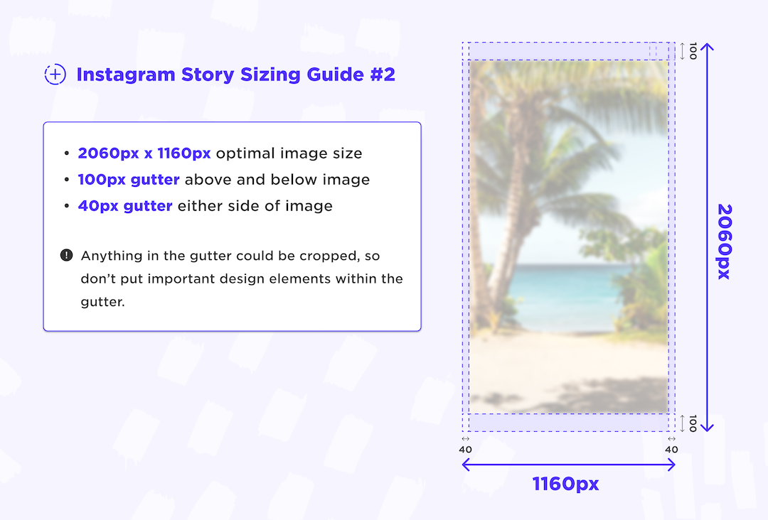
To avoid this, we recommend using images with 40px of gutter on the left and right, and 100px of gutter on the top and bottom. This will mean that your elements inside these gutters will always be shown on the majority of devices
The gutter space should be free from important design elements. Any cropping that is processed by Instagram on a particular device should ensure key design elements remain in the viewable frame.

Designing your assets with a resolution of 1160w x 2060h adds this gutter to the image. Assuming that you design with that resolution and keep your important design assets out of the gutter space (40px left/right, 100px top/bottom) your users will see the story well centred and it will reliably display on most devices.

Instagram applies compression to reduce the file size; you might find that text that was very clear on your source file may not be as clear on your published post, and compression artefacts like antialiasing have been introduced around the edges of fine text.
To reduce how noticeable these artefacts are, we recommend:
-
Exporting your media in good quality (75-85%) with a lower target file size for designed media.
-
Exporting at 1080 wide, and up to 1350 tall.
By reducing the file size, you can reduce the amount compression Instagram will apply, and have more control over the result.
Note: These compression artefacts are rarely noticeable on photo media when uploaded at full resolution, and best practice is to let Instagram do the compression work on photos.
